Color
Our color palette is organized into semantic color tokens, which have specific meaning within the system, and primitive color tokens, which establish a subset of colors that the VA uses from the U.S. Web Design System.
Primitive
Open in: Storybook
Semantic
Open in: Storybook
Component
Open in: Storybook
How to use color tokens
Primitive
It’s not recommended to use primitive tokens in your designs. These tokens will not reflect any usage guidance at the semantic or component level. Primitive color tokens will also not support theming in light and dark mode.
Semantic
If you’re looking to use a semantic token in your designs, you can find the appropriate token by understanding the taxonomy. In the mobile app library, we currently use the following options to describe our tokens:
- System
- vads: Used for tokens in the VA Design System
- Category
- color: Used for color tokens
- Concept
- action: Used for interactive elements
- feedback: Used to inform users of important changes
- Property
- background: Used for background elements
- border: Used for borders, strokes, and dividers
- foreground: Used for foreground elements such as text and icons
- surface: Used for surface elements such as alerts, cards, and rows
- Variant
- default, inverse, secondary: Used for any elements
- default, base, destructive: Used for action-related elements
- info, success, warning, error: Used for feedback-related elements
- State
- active: Used for active or onPress states
- Mode
- on-light: Used for light mode
- on-dark: Used for dark mode
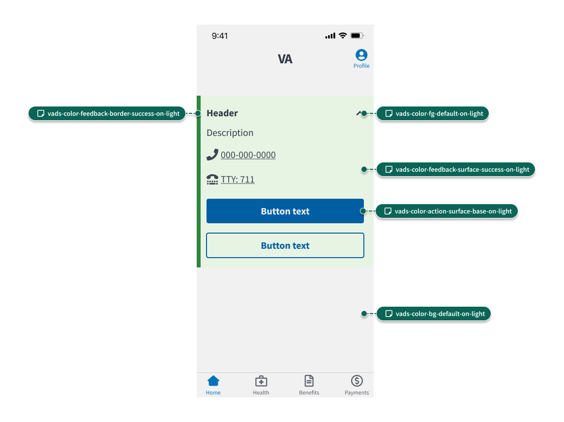
For example, let’s look at the Alert component. This component is placed on the background (vads-color-background-default-on-light) and is comprised of multiple tokens for the surface (vads-color-feedback-surface-success-on-light), border (vads-color-feedback-border-success-on-light), and foreground (vads-color-foreground-default-on-light).
Component
If you’re using a component from the design system, the appropriate component tokens are already applied.
If you’re looking to use a component token in your designs, you can find the appropriate token by looking for the component name in the token name. For example, in vads-segmented-control-color-surface-selected-on-light, the second piece of information tells us that this token is related to the Segmented Control component. After the component name, the token name follows the same naming conventions as semantic tokens.